August 22, 2024
Digital Marketing Guide
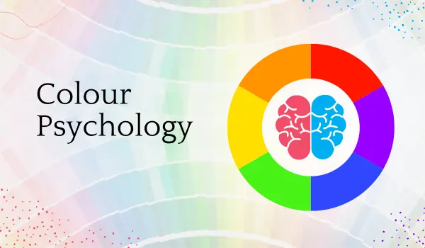
“Colours are the smiles of nature.” ― Leigh Hunt

Let’s dive into the rainbow pool of colour theory, shall we?
Warm colours are the party animals of the colour world. Such shades are sure to drown you in excitement, high spirits, and a sense of emergency—just perfect for the “Buy Now!” button on your website. Cool colours consist of blue, green, and purple, the most introverted ones at this colour cocktail party. They’re much calmer and more collected, and they will be more predisposed to making your visitors feel trust and professionalism. No wonder blue is the go-to colour for many Fortune 500 companies: it is the business suit equivalent in the colour spectrum.
Essentially, the psychology of colour in marketing is driven by colour theory and the emotional perception that we attach to an individual colour. For example, some researchers cite that as high as 90% of people’s snap judgments regarding products can be attributed to colour alone, which means the colour is very crucial in arriving at a first impression and greatly impacts consumer behaviour.

The colour in branding is not just pretty. It is the face that launches a thousand ships, or in this case, a thousand purchases. Did you know brand recognition can grow through colour alone by 80%? Actually, the odds with which you’d be able to remember a brand by its colour are higher with respect to that particular brand’s name—78% for the colour against 43% for the name. It is like that catchy tune you can’t get out of your head but for your eyes.
Take Coca-Cola, for instance. That iconic red colour is seared into our collective consciousness to the degree that you probably could spot it from space. It’s not a colour; it’s a brand ambassador that doesn’t need a paycheck. Equally, the purple of Cadbury has become associated with the brand, and it would be instantly recognizable even if you took away the brand name—powerful branding. So strongly ingrained in our brains is this that the psychology of colour in marketing is really well done in a situation like this.
Selecting a brand colour is much like dressing up for a first date. You want to impress, but you want to be yourself at the same time. That, in itself, is the tricky balancing act of colour branding psychology, understanding your audience, and finally, the personality of your brand. There is so much more to picking the right colours than personal preference. This would require a deeper understanding of colour psychology, your target market, and the personality that your brand would emanate. The blue colour dominates the pages of the world’s fortuned companies with strong branding the other reason being the fact that it creates trust and reliability.
Though colour has its unique benefits in certain situations, its meanings are different across cultures. The colour red is generally considered to be lucky and prosperous in China but is often associated with danger and warning in the West. This only seeks to emphasize the need for cultural differences when applying psychological factors in marketing for any brand. Maybe your brand is one of those daring purples or bold yellows. The bottom line is finding that colour that speaks your brand language fluently and makes a deep connection with your audience. Consider colour accessibility guidelines, too, to ensure that your colour choices are inclusive and effective for all users. Every colour choice is a moment of truth for your brand, influencing how consumers perceive and connect with your brand identity.
Proper use of colour in marketing campaigns can help drive consumer behaviour and perceptions of the brand. More than 55% of first impressions about brands are purely visual in nature and hence call for careful choice of colours in all marketing material.
One such successful example of how the use of colour in marketing really worked is the “Jaago Re” campaign of Tata Tea. Here, besides the brand identity, the colour yellow was suitably acquired by virtue of its bright colour and energy to infuse a spirit of energy and alertness among the people for the campaign. This highlights the importance of aligning your marketing colour palette with the desired emotional impact.
Choosing to play well with the right colours and investing in a highly skilled branding team can directly impact brand loyalty and consumer behaviour, as it helps to build a strong and memorable connection with the audience.
The psychology of colour in marketing goes so far that it can even guide consumer behaviour. They can be guided from attention through to action, passing through the funnel. For instance, contrasting colours for call-to-action buttons would bring about a very high click-through rate.
In addition, 81% of the consumers have to buy in a brand to buy their products while purchasing, and in turn, this can also be achieved when a brand has effective use of colour. This shows that it is very important to select those colours that symbolize your brand values and attract your target audience.
Different colours evoke various emotions and associations, forming the foundation of the psychology of colour in marketing:
The psychology of colour in marketing takes on another layer of complexity when considering gender differences in colour preferences. Studies have shown that women generally have a greater awareness of colour differences and often prefer softer hues, while men tend to gravitate towards bolder colours. For example, a study by Joe Hallock found that blue was the favourite colour for both men and women, but purple was a close second for women while rarely chosen by men.
These gender-based preferences can significantly impact marketing strategies. Brands targeting specific genders might adjust their colour palettes accordingly, while those aiming for a broader appeal might opt for more neutral tones or a diverse colour scheme that resonates across genders.
Now, although the psychology of colour in marketing suggests some general guidelines, perceptions of colour can vary widely across cultures. A telling example of this is Pepsi’s light blue marketing mistake in Southeast Asia, where it is associated with mourning and death, and it received poor reception.
In the same way, a lot of things said in human culture generally come off as inside jokes that can’t translate into other realms of existence. It was almost like a clown follows you for some burial—not the feeling they were going for sure.
On the other hand, banks like HDFC and ICICI have done a great job while trying to replicate the same colour scheme across all online and offline touchpoints. This level of visual consistency really helped these banks to be adopted for Indian consumers’ trust. Their colour palette is so uniform that it works smoother than a well-oiled engine, blending and playing a melody of colours, where every musical instrument is engaging with the right note.
By maintaining a consistent colour scheme throughout the customer journey and touchpoints, these banks have reinforced their brand identity, enhancing customer trust and loyalty across all interactions. However, this doesn’t just demonstrate the importance of colour coordination but also in cultural dimensions towards building an effective brand identity.

Ever wondered why you just can’t resist picking up that green bottle of Himalaya Herbals? Not because all of a sudden, you were into herbal products. It’s the green packaging whispering sweet nothings to your subconscious— Nature, Purity, and Wellness. It’s like the product is wearing a “I’m good for you” t-shirt. Colour is a main part of packaging and product design; when it is used right, it shall attract products, express the values of the brands, and trigger purchasing.
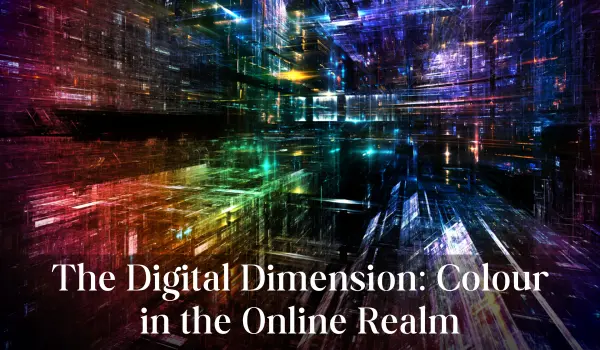
In the digital age, the psychology of colour in marketing extends beyond traditional media, playing a crucial role in online branding and user experience. Here’s how colour influences digital marketing:
With the intertwinement of branding and digital marketing, real success requires one to truly understand the colour psychology subtleties in digital contexts. This goes as far as colour accessibility, ensuring all users have the ability to interact with digital content effectively.
Just imagine that one fine day, McDonald’s decided to paint the arches purple in one country and pink in another. It’s like your best friend who comes every day with a different face – bewildering and a bit scary. Colour has to be uniform in all touch points of a brand to achieve a well-defined identity. It creates coherence both in the brand’s visuals and experience while also aiding in reiterating brand recognition and loyalty. The psychology of colour in marketing insists on this, with consistency in colour.
The more global the company, the more important the understanding and making adjustments for cultural colour tweaks. Savvy brands will land on colours that ‘feel’ right in target markets but are consistent with their brand identities. Take McDonald’s, for example. The consistency of their golden arches around the globe reinforces their brand identity and guarantees instant recognition and trust.
Certainly, don’t think you could just throw some colours on a wall and – voilà. Measurement is truly important here. It’s almost like the science equivalent of lab coats and test tubes, but with websites and package designs, we need to really harness and take advantage of the colour aspect of psychology, measurement, and analysis for business. A/B testing on the colour scheme of a website, advertisement, or even product packaging may turn up information on consumer preference and behaviour that very much mirrors the effect of looking into a crystal ball at what shades will inspire consumers to click “Add to Cart.” Other methods include:
But then, while knowing colours and their psychology is one thing, knowing what’s actually “in” in terms of colours is another. Both, however, are quite applicable to a business, or any marketing endeavour for that matter. This doesn’t mean that every year when Pantone shares its new colour of the year, you should tweak all your brand identities. On the contrary, it’s about realizing that magic formula halfway between timelessness and modern relevance; it is just a tweak or two, not a complete overhaul. That is the beauty of hitting the perfect sweet spot in making timeless choices and ultra-modern trends in colour selection.
These innovations promise to take the psychology of colour in marketing to new heights, offering more personalized and engaging brand experiences.
As the psychology of colour in marketing becomes more sophisticated, it’s crucial to consider the ethical implications. Although colour can be an effective communication tool and carrier of brand identity, there’s a fine line between influence and manipulation.
Marketers must consider:
In this context, where ethics shape the approach to colour psychology in marketing, brands have the potential to establish trust and engender an honest relationship with their target audience.
Colour psychology in marketing isn’t just a fancy term; it’s a powerful tool that can turn your brand from a wallflower into the belle of the ball. Understanding the emotional response to colour and considering cultural nuances while maintaining consistency helps create a brand identity that resonates both visually and emotionally. Effective use of colour can significantly influence consumer perception and behaviour, ultimately contributing to business success and customer loyalty.
As I reflect on that rainy Sunday at Starbucks, I’m reminded of how a simple observation can lead to profound insights. The green and white that caught my eye that day were more than just colours – they were silent brand ambassadors working tirelessly to create a cohesive and memorable experience.
As the marketing landscape evolves, the strategic use of colour remains a timeless element in crafting memorable brand experiences. It is your secret weapon in the marketing arsenal—get it right, and your brand will stand out vividly. The right colours can enhance brand recognition and make a lasting impression, helping you stake a claim in the competitive market landscape.
Ready to dive into a kaleidoscope of branding and digital marketing? Sage Titans Academy offers comprehensive courses that will empower you with the skills to master digital marketing and develop a consistent brand messaging and identity. Whether you’re new to marketing or a seasoned professional, Sage Titans Academy provides valuable digital marketing courses in Mohali and insights into new trends and strategies, ensuring your brand shines brightly in today’s dynamic market.
Our Address
Suite-1, Second Floor,
Sebiz Square Building
ITC-6, Sector – 67
Mohali – 160062, Punjab
Tel: +91 90416-55602, +91 911 511 0123
Quick Links
Sign Up For Our Newsletter
Copyright © 2024 Sage Titans Academy